
Bath Philharmonic Orchestra
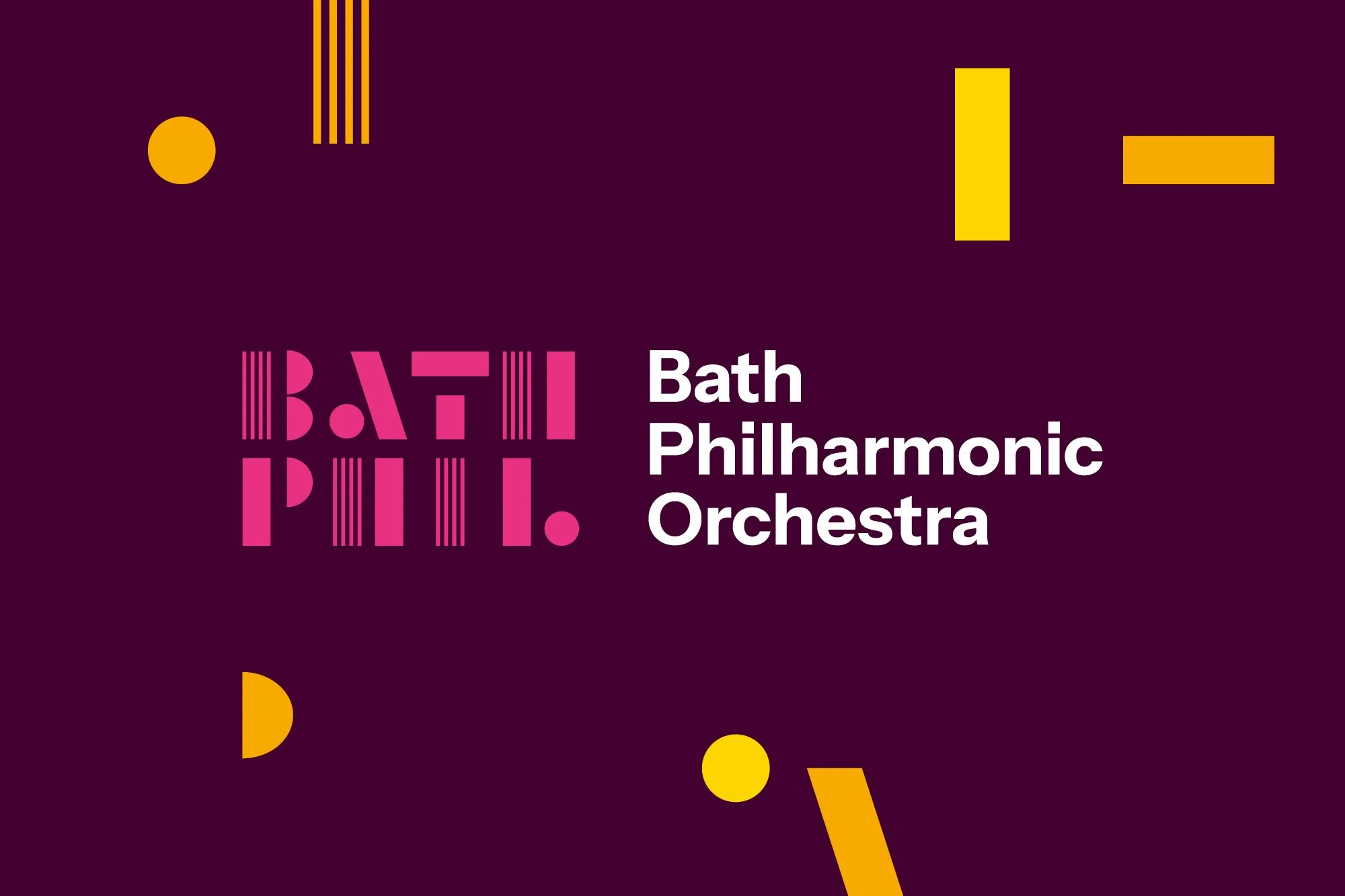
Bath Phil has evolved significantly in recent years, combining exceptional orchestral performance with an expanding programme of creative work with young carers, schools and local communities. We worked closely with the team to rename Bath Philharmonia as Bath Philharmonic Orchestra and create a new identity that better reflects who they are today and their ambitions for the future.
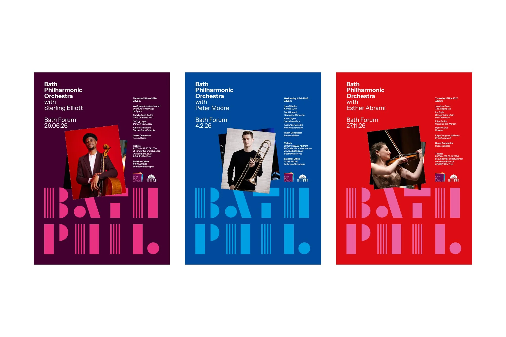
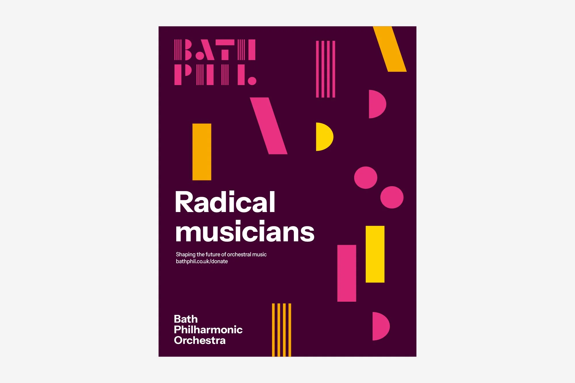
The bold new symbol brings individual forms together, representing instruments and community, with references to musical notation and Bath’s distinctive architecture. These shapes create a flexible visual language that can move, overlap and expand across applications.
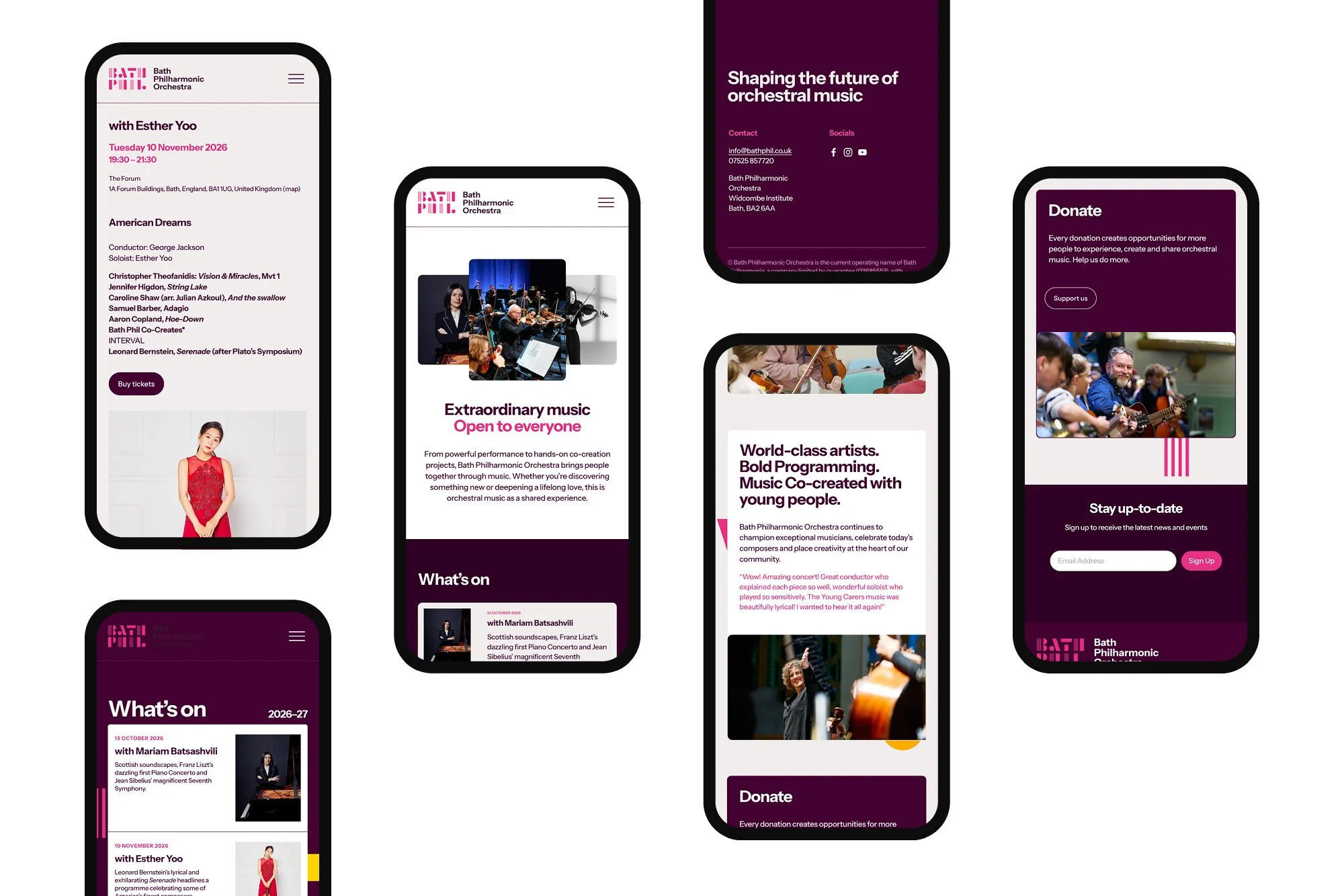
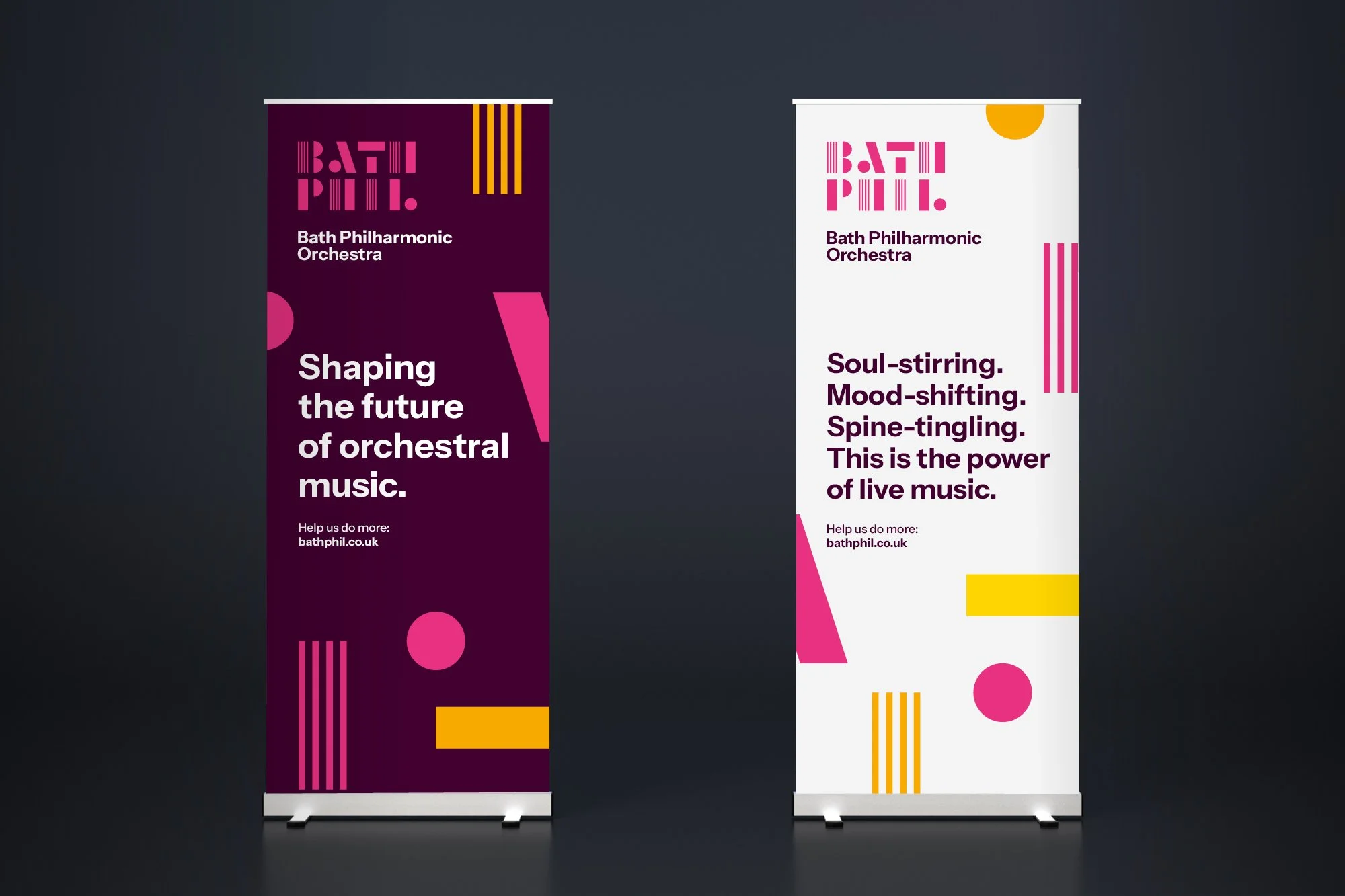
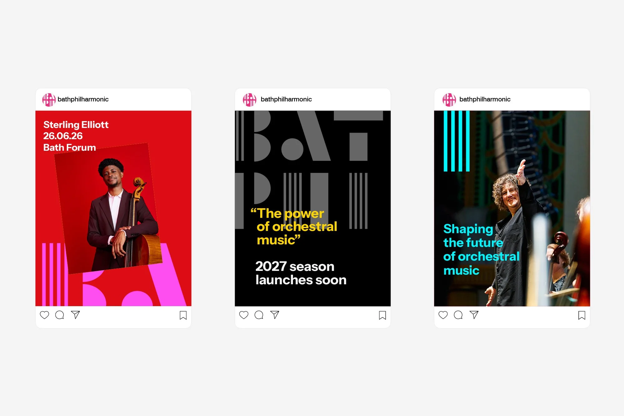
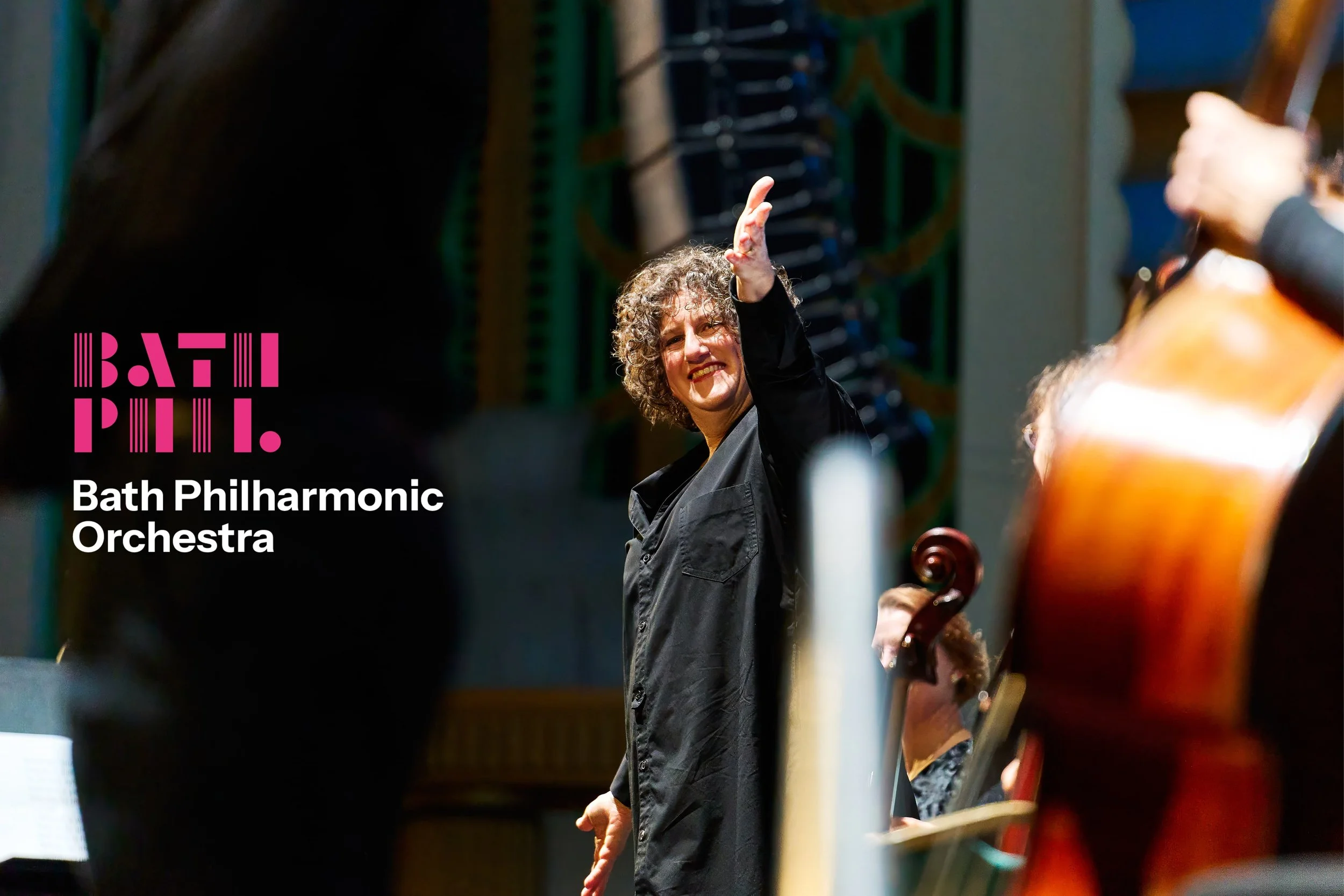
Combined with confident typography, colour and photography, the identity feels contemporary, inclusive and full of energy. Rolled out across the website, advertising, programmes and motion graphics, it reflects an orchestra bringing people together to experience, make and enjoy extraordinary music.
Industry
Charity
What we did
Naming
Messaging
Brand Identity
Print
Digital
Brand Guidelines

Collaborators
Ink Copywriters
Looking to transform your business?
Looking to transform
your business?
More case studies


Strategy,
Brand Identity,
Messaging,
Website,
Print,
Digital,
Strategy, Brand Identity, Messaging, Website, Print, Digital,
link/endomag

Brand Architecture,
Product Identity Kit,
Brand Messaging,
Visual Tool Kit,
Brand Architecture, Product Identity Kit, Brand Messaging, Visual Tool Kit,

Strategy,
Brand Identity,
Signage & Wayfinding,
Internal Engagement,
Brand Guidelines,
Strategy, Brand Identity, Signage & Wayfinding, Internal Engagement, Brand Guidelines,
More case studies
Strategy,
Brand Identity,
Messaging,
Website,
Print,
Digital,
Strategy, Brand Identity, Messaging, Website, Print, Digital,
link/endomag
Brand Architecture,
Product Identity Kit,
Brand Messaging,
Visual Tool Kit,
Brand Architecture, Product Identity Kit, Brand Messaging, Visual Tool Kit,
Strategy,
Brand Identity,
Signage & Wayfinding,
Internal Engagement,
Brand Guidelines,
Strategy, Brand Identity, Signage & Wayfinding, Internal Engagement, Brand Guidelines,
Other experience

NHS
Brand strategy, identity and guidelines for the NHS Bath and North East Somerset Clinical Commissioning Group (NHS BaNES CCG) who coordinate the delivery of health services for everyone living in BaNES.

Brimstone
Stability, durability and Britishness was at the core of this new brand name and identity for a potentially game-changing product for British wood as a more viable timber choice in building and construction projects.
National Trust
Strategic communication design development and guidelines plus other internal communications for the National Trust.
Other experience
NHS
Brand strategy, identity and guidelines for the NHS Bath and North East Somerset Clinical Commissioning Group (NHS BaNES CCG) who coordinate the delivery of health services for everyone living in BaNES.
Brimstone
Stability, durability and Britishness was at the core of this new brand name and identity for a potentially game-changing product for British wood as a more viable timber choice in building and construction projects.
National Trust
Strategic communication design development and guidelines plus other internal communications for the National Trust.